
The early Ashes of the Unbound interfaces could expose systems, but they did not yet belong to the same world. During 20–22 April I built the first shared UI language: a weathered-arcane presentation that could sit between ancient magic and improvised industry without turning every screen into unreadable decoration.
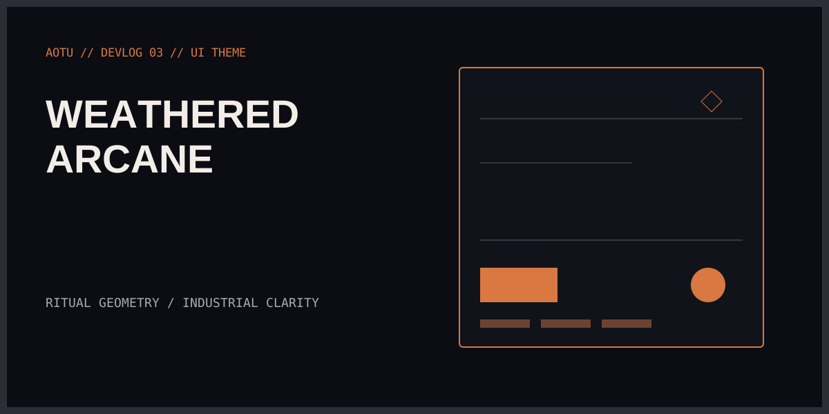
This post has no surviving in-engine captures from that phase. The development vault records the implementation and palette work, but not a clean screenshot set. I would rather say that plainly than manufacture evidence after the fact. The thumbnail is a new diagram in the site’s established visual style; it is not a game capture.
Combining arcane and industrial UI
The setting has a built-in visual tension. The Binding and its remnants suggest ritual geometry, engraved marks and old systems whose meaning has partly been lost. The factory side needs measurement, state, throughput and controls a player can read quickly.
Leaning entirely into fantasy would make production screens ornate and slow. Leaning entirely into industrial software would erase the world from the interface. The useful middle was a weathered-arcane system: restrained geometry, damaged surfaces, warm ember accents and information laid out with the discipline of an instrument panel.
The decoration should explain hierarchy, not compete with it.
Building a shared UI theme
The implementation centred on a shared UITheme rather than styling each widget independently. Colours, type roles, spacing, panel treatments and state accents belong to the theme. Individual interfaces consume those decisions.
That is mundane work with a large payoff. When the inventory, dialogue and factory screens each invent a different disabled state, the player has to relearn the same concept three times. When the project later adjusts contrast, a central theme can change the system rather than beginning an archaeological dig through blueprints.
The same rule applies to semantic colour. Ember tones can identify action or energy, but only if they are not also used decoratively everywhere. Warning, selection, focus and unavailable states need distinct roles before the interface becomes busy.
Keeping weathering legible
The word “weathered” is dangerous in UI work. It can quickly become low contrast, noisy masks and important text sitting on top of scratches.
I treated weathering as an edge and surface property rather than permission to degrade the content layer. Panels can carry irregularity. Dividers can look fabricated or inscribed. Large empty areas can hold faint marks. Labels, values and controls still need predictable alignment and contrast.
This is especially important for factory information. A production interface may contain item rates, power state, recipe inputs and failures at the same time. Atmosphere cannot come at the cost of comparing two numbers.
Designing against stable view data
The plugin architecture created a useful constraint: the UI should bind to stable view data, not reach into half-built runtime objects. That keeps a visual prototype from becoming the accidental API for a gameplay system.
It also means the theme can be tested with representative states—empty, active, warning, disabled, selected—before every final screen exists. The project gets a vocabulary early, while the exact sentences are still being written.
That vocabulary included reusable panel and frame treatments, typography roles, a restrained palette and common interaction states. It was enough to stop new screens from starting visually at zero.
What the missing screenshots changed
Looking back, this phase also taught me something about the development log itself. Code changes and task notes are not a substitute for visual evidence when the subject is visual design.
Later systems gained much stronger capture discipline. The spaceflight work records before-and-after frames, diagnostic modes and measured anchors. EvidenceRunner eventually made screenshot existence part of a test-step contract. The lack of captures here is exactly the kind of gap that later tooling was designed to prevent.
So this entry preserves both outcomes: the game gained its first coherent interface language, and the historical record did not capture it well enough. Both are true.
The next phase was considerably better documented because it broke assumptions the engine made visible immediately. On a spherical world, World Down Stops Working.