After moving the KNET and HubN configurations into Ansible, I had a much better record of what the network was supposed to look like. I still had to log into a router if I wanted to know what it was actually doing.
That works when I already know which router to check and the problem is still happening. It is less useful when a connection was slow twenty minutes ago, a route briefly moved to another path or an exporter stopped sending data without anybody noticing.
So, the next job was monitoring. I ended up with Prometheus for the usual metrics, SNMP for interface information, IPFIX for flows, BMP for routing visibility, Akvorado for analysing the flow data and Grafana to pull the different views together.
It started as an attempt to get some useful graphs. It now covers the router fleet, the routing topology, HubN, KNET’s internal paths and some of the platforms behind the network. Like the router configurations, the dashboards and alerts are built from source rather than maintained by clicking around in production.
Collecting the Data
I initially wanted one place to answer a simple question: what is the network doing? Unfortunately, there isn’t one metric or data source that can answer it.
Prometheus collects interface counters, errors, system resources, BGP state and exporter health. It is good at showing that something changed and when it happened.
SNMP supplies the interface names and descriptions. A flow which says it arrived on interface 14 isn’t especially helpful until I know what interface 14 is connected to.
IPFIX records what sort of traffic moved between different parts of the network, rather than only counting bytes on an interface. BMP exports the routing view so I don’t have to turn every routing question into an interactive session on a router.
Akvorado receives and classifies the flows, and Grafana puts the useful parts of all of this on the same set of dashboards.
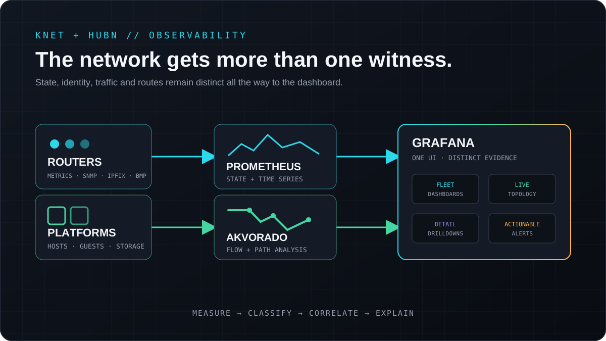
Interface counters, traffic flows and routing state each answer a different part of the question.
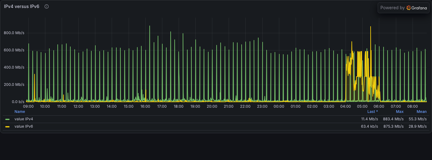
IPv4 and IPv6 traffic over 24 hours. I can still inspect the underlying flows when the aggregate needs explaining.
The Ansible work turned out to be useful here too. Interface descriptions now contain a small amount of structured information: which network the interface belongs to, what it does and, where useful, what is on the other side. The configuration templates, flow classifier and dashboards can all use the same names.
It took a little effort to make the naming consistent, but it beats trying to remember what eth3.4053 was doing on a particular router.
Untangling the Topology Views
My first topology view had everything in it. It looked impressive and was almost completely useless.
The physical underlay, encrypted mesh, BGP adjacencies, HubN relationships and out-of-band management paths overlap, but they aren’t the same thing. Drawing every connection in one panel produced a rather nice bowl of noodles, so I split them up.
The routing view follows live BGP relationships. The physical view shows the paths which actually carry traffic. HubN has separate peer and traffic views because its policy is different from KNET, while the internal dashboard includes management and private paths which don’t belong on the Internet-routing map.
Where I have flow data, links can show direction, volume and changes in path use. Interface counters fill the gaps where flow classification hasn’t been mapped yet. The NOC wallboard picks out the small set of panels needed to answer “is everything broadly okay?” on a 1080p display. The detailed dashboards are there for the inevitable “apparently not; why?”
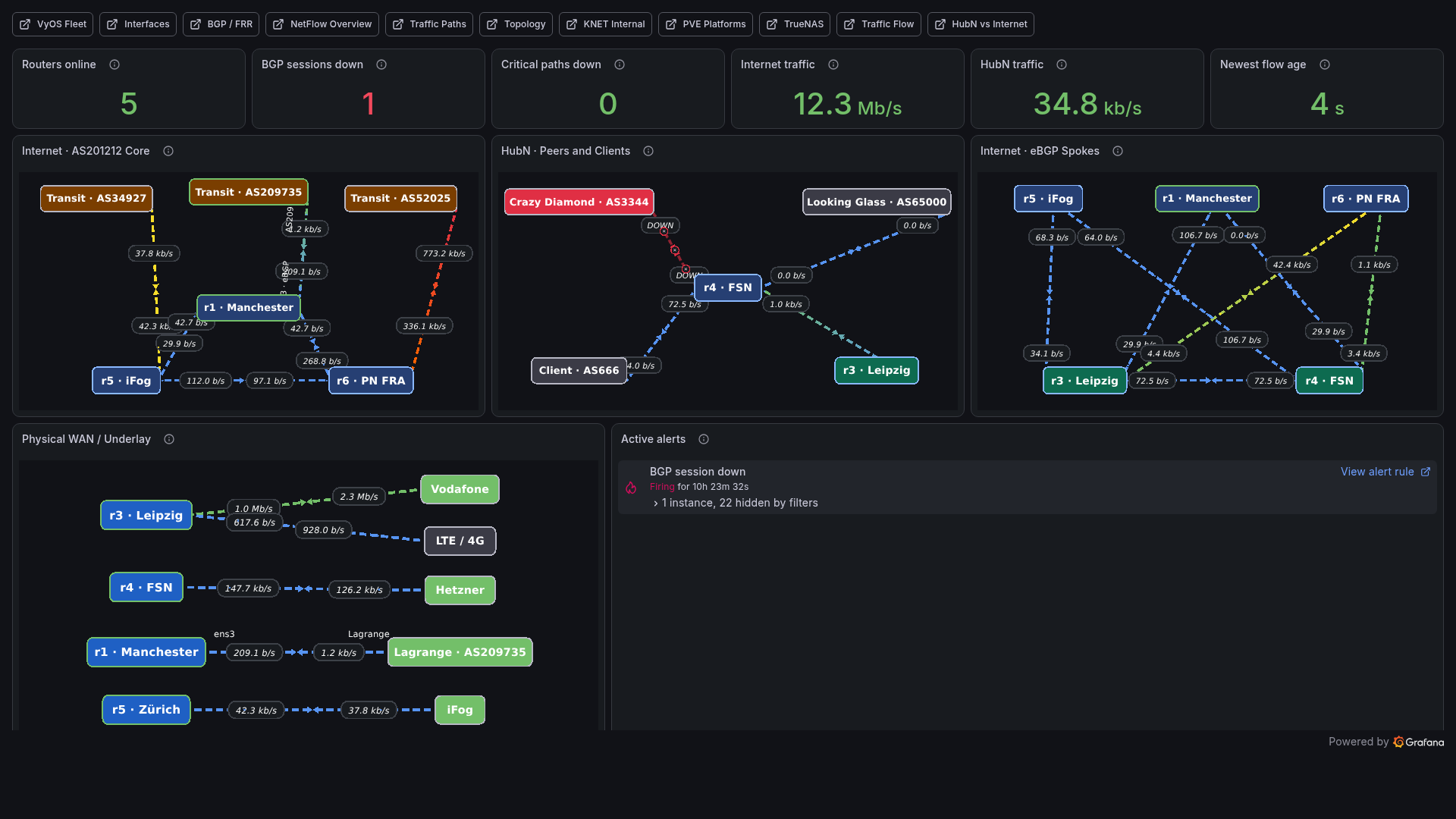
The live wallboard. The routers and critical paths are healthy, while one non-critical BGP session is down and alerting.
The live state matters here. A link being configured doesn’t mean the adjacency is up, the destination is reachable or any traffic is using it. I didn’t want the dashboard drawing a cheerful green line just because the link exists in a configuration file.
Building the Dashboards
I didn’t want to maintain a pile of Grafana JSON copied out of the browser. Small JavaScript builders generate the dashboards from source-controlled topology and panel definitions. The generated JSON is committed too, so I can see the actual dashboard change in a review and deploy it without putting a development environment on the collector.
The build adds the same navigation and topology data everywhere. Grafana provisions the dashboards as read-only, and ordinary authenticated users remain viewers. If I want to change a dashboard, I change the source and rebuild it.
The deployment checks PromQL against Prometheus, flow queries against ClickHouse, topology references against the model and navigation links against the generated dashboard set. Collector configuration is validated before reload. The previous version is kept around and restored if the replacement is rejected or fails its health check.
I can still make a bad graph. At least now I can see how I made it and won’t lose the fix the next time the dashboards are deployed.
Alerting on the Monitoring
The first alerts were the obvious ones: routers disappearing, BGP peers going down and interfaces reporting errors. Then I had to monitor the monitoring system as well, because of course I did.
A flow collector can be running but no longer receiving useful flows. A scrape can succeed while a textfile collector has stopped updating its data. A graph can be flat because the network is stable, or because the process producing it died yesterday. The alerts therefore check freshness, collector pressure and missing data as well as the network itself.
The current rules cover routing, hardware, platform state, storage and the monitoring services themselves. There are now more than a hundred of them, all in source control and grouped by what they protect. Notifications arrive in Discord with consistent names and enough context to find the relevant panel.
That is admittedly a lot of alerting for a small network. The useful part isn’t the number, though; it is knowing that the rules actually evaluate and query the data I think they do. An alert which never runs successfully isn’t going to be much help when something breaks.
Adding Proxmox and TrueNAS
Once the routers were visible, I kept running into problems which looked like network problems but actually started somewhere behind them.
The monitoring now includes the Proxmox clusters and their external quorum voters, including host, guest, storage, HA and quorum state. TrueNAS supplies storage, ZFS, disk, NFS and system telemetry through a tightly mapped receiver. I keep that data separate from the router metrics, but link it through the same navigation and alerting setup.
The Leipzig site also has several WAN paths with very different characteristics. Its queues and layered traffic shaping are exported directly, rather than guessed from a speed test after somebody notices a problem. The configuration tells me what the policy should be; the queue telemetry shows whether it is doing that under load.
A healthy BGP session isn’t much consolation when the virtualisation cluster behind it has lost quorum. In the other direction, a healthy storage pool doesn’t explain a saturated uplink. Having both available from the same place makes it much faster to work out which layer I should actually be looking at.
What the Dashboards Add
Ansible tells me what the topology, routing policy, firewall rules and services should look like. The monitoring stack tells me what peers and paths are active, where the traffic is going, whether queues are filling and how all of that changed over time.
Neither is a replacement for the other. A dashboard isn’t the source of the router configuration, and declared configuration isn’t proof that the router is behaving the way I expect. Having both means I can ask something more useful than “is the network broken?” I can see whether a configuration drifted, a route moved, traffic followed it, a queue filled or the tool reporting all of this stopped working.
The wallboard does look pleasingly like a small network operations centre, which I won’t pretend isn’t part of the appeal. More importantly, it has already made it much faster to get from noticing a problem to looking in the right place.
Previously: Moving KNET and HubN to Ansible.